
Boost Your Decision Making Power with Advanced Data Visualization
Data can drive impactful change. When considering program or policy options, you need to transform complex data into clear, action-ready insights. Advanced data visualization techniques provide holistic views of data from multiple perspectives and point the way to sustainable solutions that improve outcomes. Our end-to-end data expertise helps decisionmakers see clearly and act confidently with interactive visualizations and dashboards.
Charting Progress and Uncovering Trends
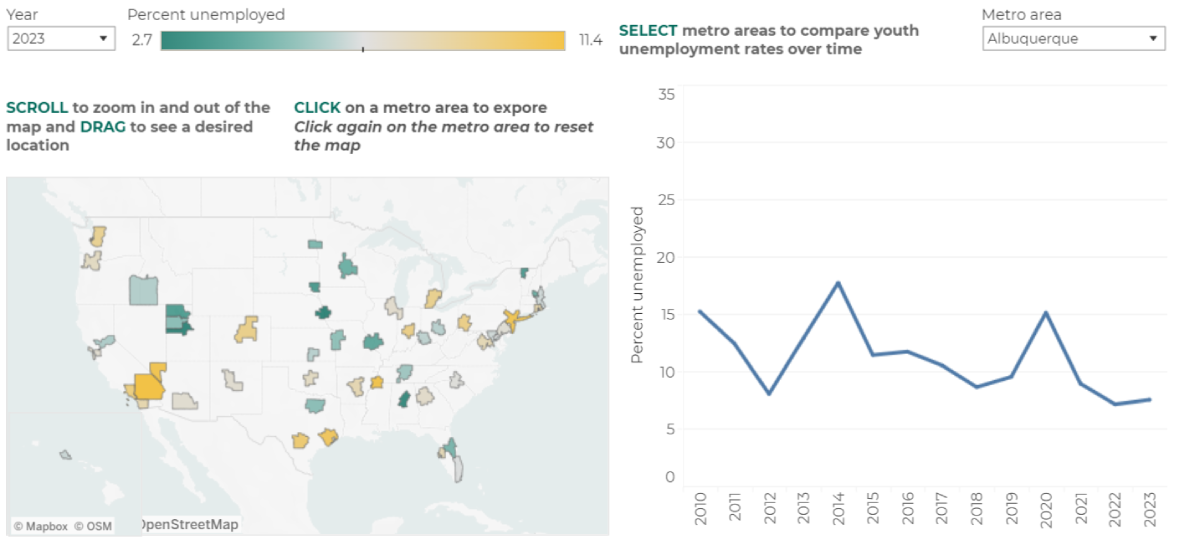
Longitudinal data is essential for evaluating the effectiveness of policies and programs, including how individual experiences and characteristics influence outcomes and how variables change over time. Analyzing this data helps to identify patterns, trends, and long-term changes that cross-sectional data cannot reveal. To help foundations and policymakers get the most out of limited resources to support youth during the pandemic, we partnered with the Schultz Family Foundation to analyze data on disconnected youth. We combined micro-level employment data from IPUMS and from the U.S. Bureau of Labor Statistics to produce a series of visualizations that revealed stark differences between 2019 and 2020 youth unemployment trends. The team went on to develop a monthly, semi-annual, and annual data series on youth unemployment.
We're also working with the Substance Abuse and Mental Health Services Administration (SAMHSA) to develop monitoring and reporting dashboards that help grantees track progress as they work to reduce the impacts of mental health and substance use across communities.
Combining Data Sources for Deeper Insights
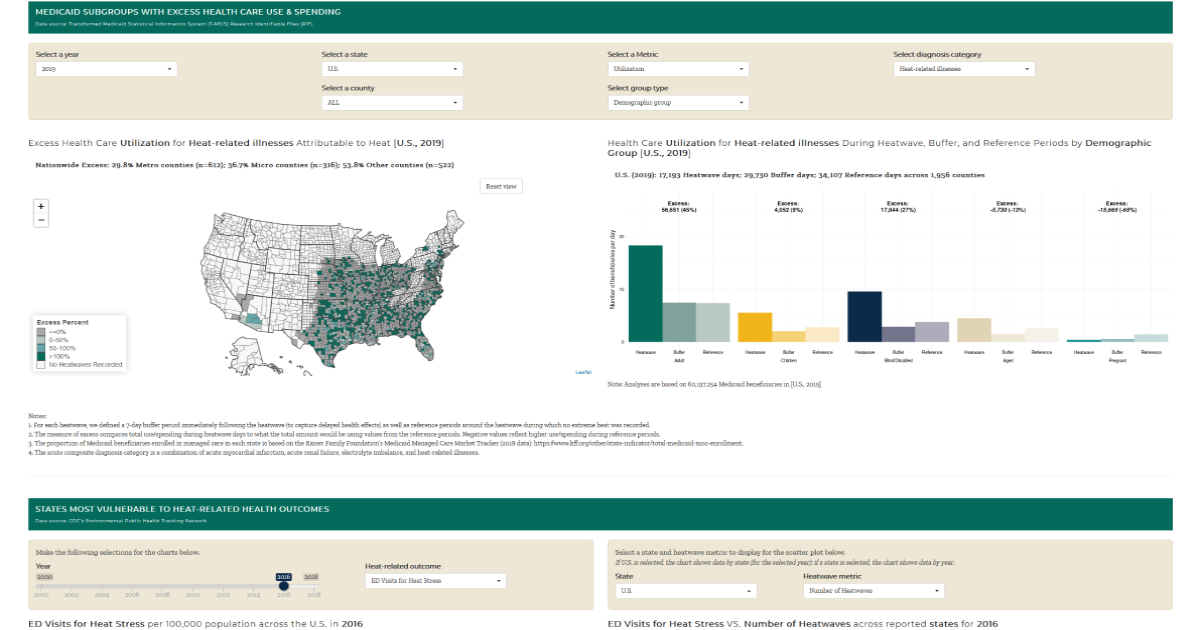
Successful data sharing requires collaboration, strict data governance, and access to the right technologies. With experience collaborating across sectors to combine disparate data sources, we help clients synthesize data from multiple sources to uncover deeper insights. One example of this work is ClimaWATCH – an interactive tool for climate vulnerability assessments that shows how heat waves have impacted health care utilization and spending among Medicaid beneficiaries. ClimaWATCH combines multiple data sources to make it easy to explore relationships between exposure to heatwaves and to climate hazards based on social and environmental factors and heat-related health issues at the county, state, and national levels.
Another example is our Health Systems Dashboard that allows health care decision makers and policy makers to explore and compare hospital readmission rates for various types of health care systems across states. This tool combines data from the Agency for Healthcare Research and Quality’s Compendium of U.S. Health Systems, hospital-level readmission measure data from the Centers for Medicare & Medicaid Services’ Hospital Compare, and the Centers for Medicare & Medicaid Services’ Hospital Cost Report data.
Preparing for the Future with Predictive Analytics
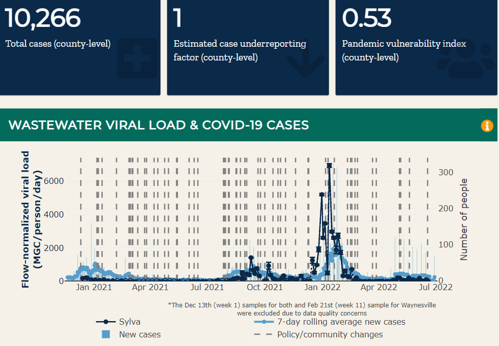
Data visualization is a crucial part of effectively using predictive analytics to make decisions. Visualizations make complex data more accessible, helping stakeholders quickly grasp insights and trends. Similarly, data visualization can illustrate patterns, correlations, and anomalies that might not be evident in raw data., and facilitate clearer communication of predictive models and their results to non-technical audiences. Visualizations can also aid in interpreting predictive outcomes, supporting better decision-making based on data-driven insights. As we learned during the COVID-19 pandemic, thinking through ways to develop flexible frameworks for wastewater sampling, testing, and reporting can avoid unnecessary system overhauls for future infectious disease, chronic disease, and drug epidemics. At the height of the pandemic, our COVID-19 Wastewater Dashboard provided a dynamic way to predict surges, transforming wastewater testing from an academic exercise into a tool for epidemic response.
We also partnered with Biobot Analytics and the Washington/Baltimore High Intensity Drug Trafficking Area to develop a tool that uses advanced analytics and wastewater data to predict surges in drug overdoses more than a week in advance.
Visualize Your Path to Progress
Whether you're considering a small policy update or a large-scale program shift, Mathematica's end-to-end data capabilities deliver the insights you need to make evidence-driven decisions. Partner with us to unlock the full potential of your data to make a lasting impact.