Federal programs that provide disability benefits, such as Social Security Disability Insurance (DI) and Supplemental Security Income (SSI), are not well understood at the state and county level. Because states and local governments administer a host of other programs that also provide services to people with disabilities, there is a need to better understand the prevalence and program participation of people with disabilities on a local level to support improved service delivery.
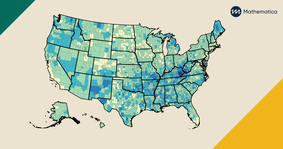
We created interactive state and county disability maps for adults ages 18 to 64 to help policymakers and program managers focus on the areas with the highest need among working-age people with disabilities. These maps allow users to compare disability prevalence and participation rates in DI and SSI across states and counties. The maps are an extension of Mathematica’s Center for Studying Disability Policy work to collect data and conduct research to improve programs and policies that affect the lives of people with disabilities.
State and local officials who want to support residents with disabilities, a population particularly hard hit by the pandemic economy, could benefit from these data on their communities. Our maps provide local context that national statistics do not. For example, they show a wide range in disability prevalence at the state level—from 7.7 percent in New Jersey to 17.0 percent in West Virginia—and we see similar variation in DI and SSI participation rates. Within each state, the maps show further variation by county.
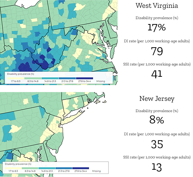
Comparison of the prevalence of disability in New Jersey and West Virginia.
Sources: Disability prevalence statistics come from the 2014 to 2018 American Community Survey five-year estimates. DI and SSI program participation statistics come from 2018 data published by the Social Security Administration.
Having a clear picture of the geographic variation in disability prevalence and program participation can help policymakers and program managers better identify areas with the highest needs or largest benefit discrepancies, enabling them to efficiently target assessments, outreach, services, and early interventions for working-age people with disabilities. Right now, this information could be especially useful in targeting efforts to increase COVID-19 vaccine access for people with disabilities and providing employment assistance for workers with disabilities, who have been disproportionately affected by the pandemic.
To develop these maps, we used population statistics from the 2014 to 2018 American Community Survey five-year estimates generated by staff from the University of New Hampshire Institute on Disability. We also used published statistics from the Social Security Administration. Linking related data and presenting trends through maps and other visual tools can uncover insights that can drive change in programs and policies affecting people with disabilities. In the future, we hope to expand on these insights by adding new information, such as socio-demographic characteristics and the prevalence of certain disabling conditions, to further guide program managers and policymakers as they seek to better distribute vital services and resources.