In health care, one of the biggest barriers to fully understanding patients’ wellness is the size, complexity, and fragmented nature of patient data. Public health experts believe that most of the factors that explain a person’s health are social factors, such as access to housing, food, and steady employment, and a person’s direct medical care plays less of a role. Yet it is difficult to find, connect, and distribute different data sources covering these social factors, often referred to as social determinants of health. At the end of 2019, the federal Agency for Healthcare Research and Quality (AHRQ) announced a challenge to identify tools that help organizations visualize data related to patients’ social determinants of health.
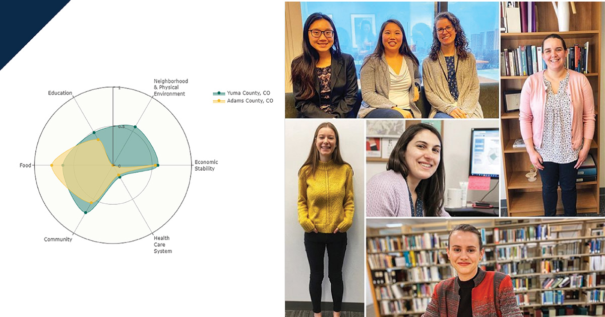
In February, we—a team of data scientists, user experience designers, and researchers from Mathematica—won AHRQ’s challenge with the interactive dashboard tool prototype we created and named the Community Connector. We are grateful for the award and proud of the journey that led to this specific tool. For the AHRQ challenge, we wanted to demonstrate how publicly available data sources could promote community collaboration and health policy change. By showing policymakers, researchers, and practitioners how their communities compared with others, the Community Connector can highlight the positive impacts of using social determinants of health data. We hope this tool will draw attention to recent social determinants of health initiatives, encourage innovation, foster peer-to-peer learning between communities, and (eventually) identify promising practices.
To turn this vision into reality, our team selected the public data of social determinants of health we wanted to use in the Community Connector and decided on the best way to present our findings. Here’s how we did it.
First, we identified the appropriate data. We started by identifying national and local data sources such as Area Health Resource Files from the Health Resources and Services Administration, County Health Rankings from the Robert Wood Johnson Foundation, and social mobility data from the Opportunity Atlas. To develop the tool within the competition’s short time frame, we focused on only one state, Colorado, and a narrow set of health outcomes related to the health conditions: obesity, diabetes, and kidney disease. This narrow focus enabled us to leverage data sources unique to Colorado, which we found through Colorado’s Department of Public Health and Environment. Although we limited the prototype to one state and certain kinds of health data, we designed the tool so that people could use the same analysis, methodology, and visualizations for other communities and outcomes.
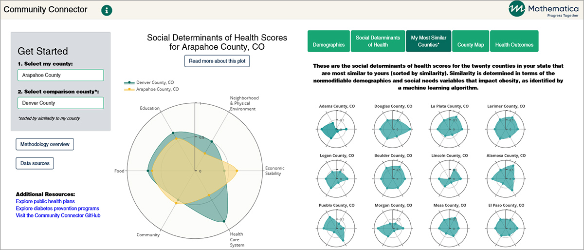
Second, we visualized the social determinants of health for each community. We created a single, user-friendly visualization called the “fingerprint” that illustrates a summary of a community’s social needs.
This fingerprint is based on outcome-independent county-level scores for six domains of social determinants of health identified by the Kaiser Family Foundation. On a scale of zero to one, Community Connector users can assess how strong (close to one) or weak (close to zero) a county is in each of six domains:
| Domain | Examples of included factors |
|---|---|
| Economic stability | Employment, income, expenses, debt, medical bills, and support |
| Neighborhood and physical environment | Housing, transportation, safety, parks, playgrounds, walkability, and geography |
| Education | Literacy, language, early childhood education, vocational training, and higher education |
| Food | Hunger, access to healthy options |
| Community and social context | Social integration, support systems, community engagement, discrimination, and stress |
| Health care system | Health coverage, provider’s availability, provider’s linguistic and cultural competency, and quality of care |
To develop scores for each of the six domains, we had to identify the factors (or variables) that illustrate a community’s strength in that area. To select variables for each domain, our team combined evidence from published literature with a sparse principal component analysis, a type of analysis that finds the combination of variables that best represent variation in the data. The domain scores are a weighted average of the normalized selected variables. In other words, we translated the combined data from variables in each of the six domains into easy-to-compare fingerprint scores between zero and one.
Third, we created mechanisms for users to compare their community with other communities on social determinants of health, demographics, and health outcomes. We built regression models to predict each health outcome and then determined county similarity using the model output of the variables the counties cannot easily change. This regression-based methodology effectively provided reasonable comparison communities based on social needs that could affect people’s health outcomes. We then developed three data visualization features in the Community Connector tool to help users find similar counties:
- A list of the 20 most similar counties and their fingerprints
- Graphs showing how a given county compares with others in the state on 12 measures of health related to diabetes, kidney disease, and obesity
- A map of counties color coded by degree of similarity
Finally, we set up a plan to collect feedback from users throughout the development phase of the Community Connector tool. We wanted to ensure that the tool was user friendly and conveyed information intuitively for a variety of audiences. It was important to us that people could interpret the data visualizations accurately and quickly. User testing provided us with the qualitative data we needed to develop instructional content for users, identify and address areas of confusion, and design more seamless navigation between data visualizations. In total, we completed 16 user tests and 7 design iterations to make the Community Connector tool.
We are proud of the prototype and excited by the possibilities it has. With more time and funding, we see the potential for a wider range of uses of the Community Connector. For example, we could expand the tool to include all communities across the country, with analyses of more health outcomes and service use data. Future iterations could enable policymakers, researchers, and practitioners to upload their own county-level data to further customize their search for similar communities. In the future, it could even provide opportunities for similar counties to collaborate with each other to solve challenges that their communities share. Because of the AHRQ’s challenge, we now have the processes, methods, and team to get us there.
To learn more about the Community Connector tool, view our prototype.


